Data Analysis Visualization tool
For a SaaS and no code/low code solution that offers automated repetitive data reconciliation processes, with data software in the cloud, for the financial and operational corporation analysis.
Client
Private
Role
UX Designer and Researcher
Date
2022-2023
Industry
Fintech
Project Overview
Data Visualizer
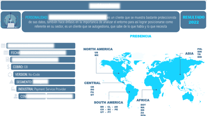
Image source:
My role
Product designer and Researcher
Worked alongside UI designer and supported by the product team.
Project Context
Under what context did the project started?
Reconciliation is comparing two databases to verify that they contain equivalent information or explain why they do not. The problem appears when dealing with millions and millions of data, that’s what Simetrik does. Creating global filters for the new Data Analysis module that affects all the visuals, in order to facilitate navigation on the charts and spreadsheets.
Client's Context
What was the company's situation?
Simetrik is the SaaS and no code/low code solution that offers the right balance between flexibility and robustness for the financial and operational reconciliation automation process with data software in the cloud. It can automate repetitive data reconciliation processes. The result is a “unique detailed source” using for Controlling, Reporting, Business Intelligence y Contability. Also the secure big-data infrastructure guarantees operational, compliance, and reputational risk control supporting high volumes of data combining a world-class team, and allowing customers to implement and trust Simetrik at scale
Project Impact
l
Timeline
Planning
Design wireframes

Research Planning
The problem
Users can’t analyze the data because the dashboards don’t have global filters. Some dashboards have many charts where they analyze the status of their processes, and not having a main filter to select only what they want to see is a huge problem, the other issue appears when dealing with millions and millions of data.
Challenges and Goals
Give to users the possibility to select the range of dates they want to see on the data visualization. The idea was to create different filters, we decided to approach only with the date filter for mvp reasons.
Success Criteria
We needed to know:
what do the users want to achieve by filtering the data?
How other data analysis tools create filters on their dashboards?

Methodology
Planning
Strategy
Global filters: That can coexist with the visualizations filters
Save filter’s settings: So users can use it again and again
Dynamic filters: Yesterday, last week, last month
Data loaded: What the user needs
The process
Desired outcome
Analysis and synthesis process
Project Deliverables
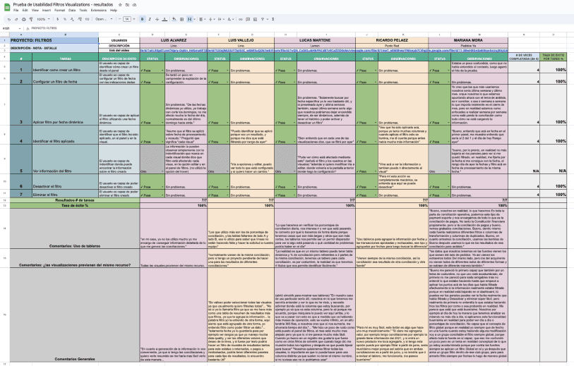
Research Test results
I l
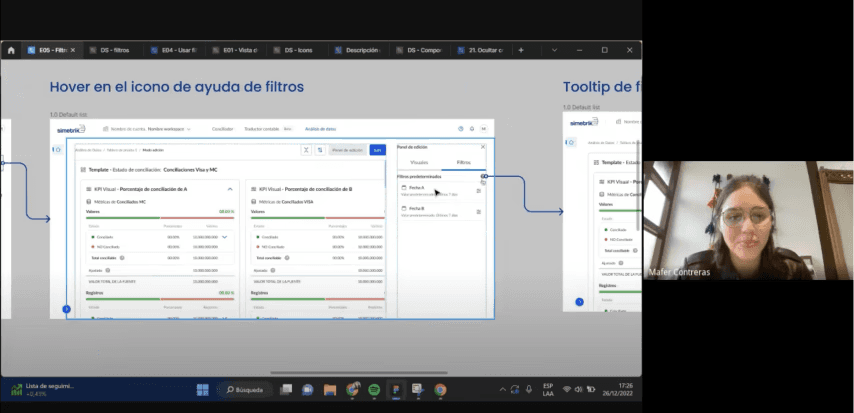
Final design
I worked closely with engineers to validate the design and implementation. Along with daily stand ups, we also had a weekly check in with the stakeholders.
Sharing and reporting
My methodology
Users wants to leave the filter selected forever: They usually need to see the same range of dates
Usually, the data of each dashboard comes from the same database: This can improve the performance
There are many ways to detect a selected filter: To take this into consideration
Next Steps
Predetermined filters: Ranges the user can preset
Determine date column: For each chart
Show only the last 90 days of data: that's what users need and that helps to improve the web app performance

Image source: data, more users adopted the data visualizer tool
Project Impact
Improved dashboard processing costs by 20% by just bringing the relevant data
Maintain low costs less than 10% of Revenue (Snowflake + RDS)
Goal: NPS > 80%